
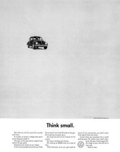
A television ad has thirty seconds, a soundtrack, and a captive audience. A print ad gets one frozen moment on one page — and if it fails to stop you, it never gets another chance. That constraint is exactly why the greatest print ads are the purest lessons in persuasion ever created.
The ads on this list sold cars, diamonds, mouthwash, and watches. But more importantly, each one demonstrates a specific, nameable persuasion technique — self-deprecation, manufactured scarcity, fear, social proof, flattery — executed so well that marketers still copy the formula decades later. For each ad below, we name the technique so you can spot it (and steal it).
We have already covered the 27 most persuasive TV ads of all time. Today, we turn to the medium that started it all: ink on paper.
What Makes a Print Ad Persuasive?
Nearly every entry on this list leans on one of a handful of classic levers. Ethos builds trust in the speaker (Rolls-Royce quoting an engineering detail). Pathos targets emotion (Listerine’s bridesmaid, De Beers’ forever). Logos argues with facts (VW’s honest little car). Layered on top are the modern persuasion mechanics: social proof (everyone drinks milk), scarcity and loss aversion (a diamond is forever; you never actually own a Patek Philippe), humor and pattern interrupts (a car called a lemon), and identity appeals (the Marlboro Man, Think Different). Watch how often the product itself barely appears — the most persuasive ads sell who you become, not what you buy.
The 18 Most Persuasive Print Ads of All Time
1. Volkswagen — “Think Small”
- Brand: Volkswagen
- Agency: Doyle Dane Bernbach (DDB)
- Year: 1959
- Technique: Radical honesty as a pattern interrupt
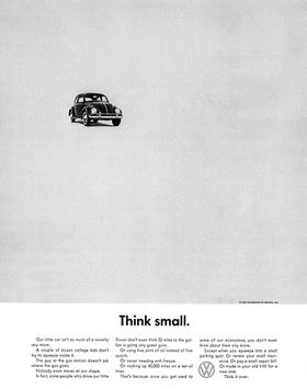
In 1959, American car ads were paintings of enormous chrome-finned sedans gliding past country clubs. Then Doyle Dane Bernbach put a tiny black-and-white Beetle in the corner of a nearly empty page under two words: “Think small.”
Art director Helmut Krone and copywriter Julian Koenig broke every rule on purpose. Instead of hiding the Beetle’s weaknesses, the copy celebrated them: it’s small, it’s slow, it’s cheap to run. In a market drunk on excess, honesty was so unexpected that it stopped readers cold — and made every competing ad on the page look like a lie. Ad Age later named the campaign the greatest of the 20th century, and the Beetle became a fixture of American driveways.
The persuasion lesson: admitting a small flaw buys enormous credibility for everything else you claim.
2. Volkswagen — “Lemon.”
- Brand: Volkswagen
- Agency: Doyle Dane Bernbach (DDB)
- Year: 1960
- Technique: Self-deprecation that flips into proof of quality
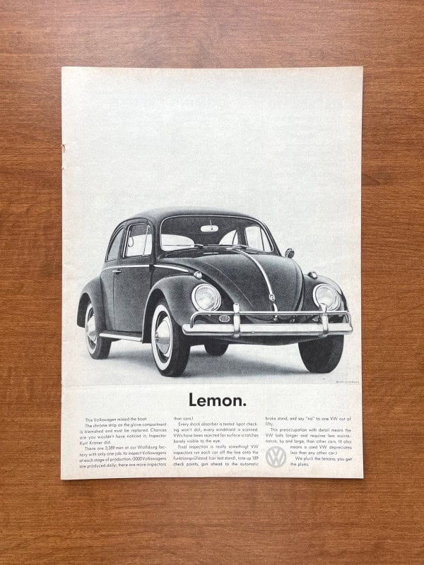
One year after “Think Small,” DDB doubled down: a pristine photo of a Beetle above a single, brutal word — “Lemon.” No car company had ever called its own product a dud in a national ad.
The reveal comes in the body copy: this particular car was rejected by inspector Kurt Kroner because the chrome strip on the glove compartment was blemished. The ad then explains that Volkswagen employed 3,389 inspectors who pulled cars off the line for flaws you’d never notice. The closing line — “We pluck the lemons; you get the plums” — turned an insult into the most memorable quality guarantee in advertising history.
The persuasion lesson: a shocking headline earns the read; a specific, verifiable detail (one inspector’s name, one chrome strip) earns the belief.
3. Avis — “We Try Harder”
- Brand: Avis
- Agency: Doyle Dane Bernbach (DDB)
- Year: 1962
- Technique: Underdog positioning
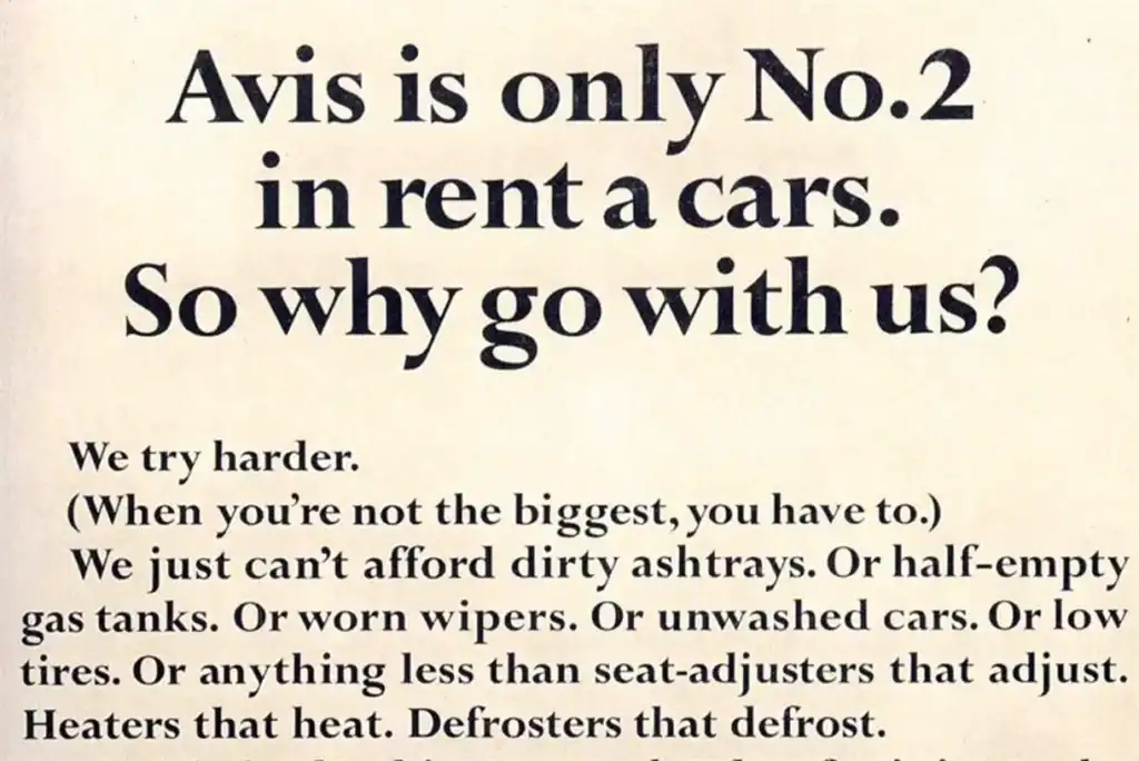
“Avis is only No. 2 in rent a cars. So why go with us?” No brand had ever opened an ad by admitting it was losing. Copywriter Paula Green’s answer — “We try harder. (When you’re not the biggest, you have to.)” — turned second place into a customer benefit: shorter lines, cleaner ashtrays, full gas tanks.
At the time, Avis had been unprofitable for over a decade. Within a year of the campaign’s launch the company was back in the black, and its market share climbed steadily against Hertz through the 1960s. “We Try Harder” stayed the company’s slogan for half a century.
The persuasion lesson: people root for underdogs — and they believe underdogs have to earn their business.
4. Rolls-Royce — “At 60 miles an hour the loudest noise in this new Rolls-Royce comes from the electric clock”
- Brand: Rolls-Royce
- Agency: Ogilvy, Benson & Mather
- Year: 1958
- Technique: The telling detail (logos)
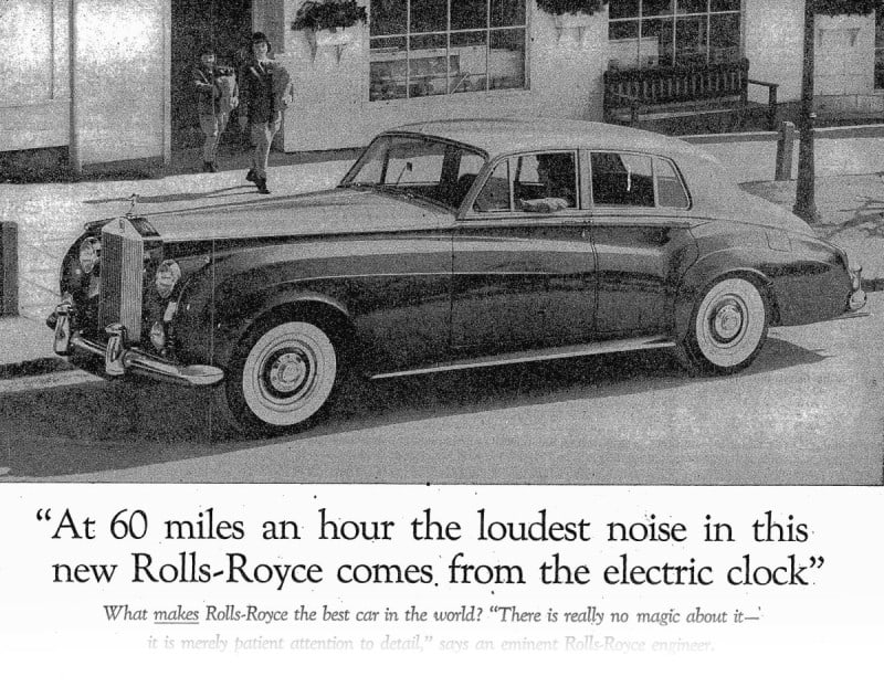
David Ogilvy spent three weeks reading about the car before writing what he considered his finest headline — and it wasn’t even his sentence. He lifted it from a technical editor’s review, because no invented superlative could compete with one precise, believable fact.
The body copy continues in the same spirit: thirteen numbered facts, each concrete, none of them shouting. The understatement flatters the reader’s intelligence — Rolls-Royce buyers don’t need to be sold, just informed. By Ogilvy’s account, Rolls-Royce’s US sales rose about 50% the following year, and the headline is still taught in copywriting courses as the gold standard of “show, don’t claim.”
The persuasion lesson: one specific detail out-persuades a page of adjectives.
5. Hathaway Shirts — “The Man in the Hathaway Shirt”
- Brand: Hathaway
- Agency: Hewitt, Ogilvy, Benson & Mather
- Year: 1951
- Technique: Manufactured intrigue (story appeal)
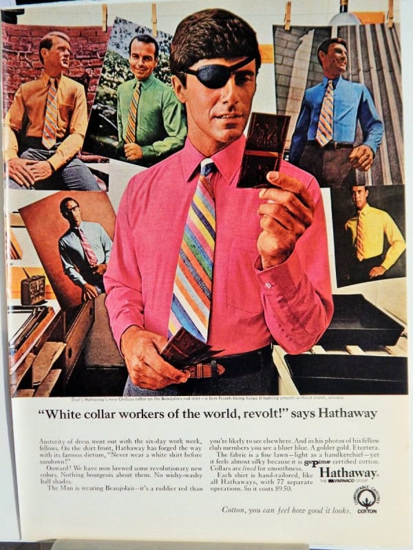
Hathaway was a small Maine shirtmaker with a fraction of Arrow’s ad budget. Ogilvy’s solution cost about fifty cents: on the way to the photo shoot, he bought a black eyepatch and put it on the model, aristocratic-looking Baron George Wrangell.
The patch explained nothing and implied everything — a duel? a war? a polo accident? Ogilvy called it “story appeal”: an unresolved question that makes the viewer stop and invent a narrative, with the product embedded in it. The first ad ran in The New Yorker; within five years Hathaway’s sales had doubled, and the eyepatch ran for years afterward.
The persuasion lesson: curiosity is a stronger stopping force than beauty. Give readers a mystery and they’ll finish the story for you.
6. Marlboro — The Marlboro Man
- Brand: Marlboro
- Agency: Leo Burnett
- Year: 1955
- Technique: Identity transfer
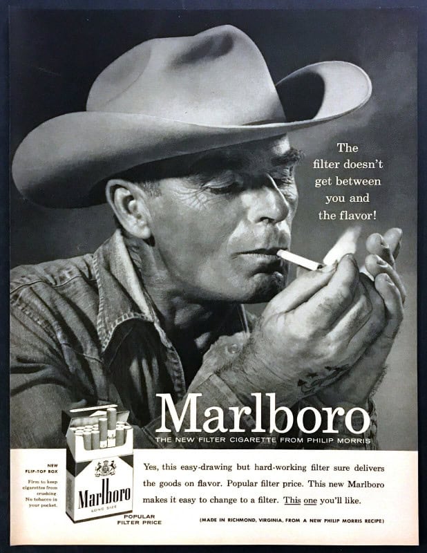
Hard as it is to believe now, Marlboro launched as a women’s cigarette with a red filter tip to hide lipstick marks. When filtered cigarettes needed to win over men in the 1950s, Leo Burnett’s fix was not an argument — it was a face. The cowboy: weathered, silent, entirely self-reliant.
Within roughly a year of the cowboy’s 1955 debut, Marlboro climbed from under 1% market share to America’s fourth best-selling cigarette brand — and it eventually became the best-selling cigarette brand in the world. The ads made no claims at all. They simply showed a man other men wanted to be, holding the product. (It’s also a sobering case study — several actors who portrayed the Marlboro Man later died of smoking-related disease, and the campaign is now a textbook example of persuasion used against the consumer’s interest.)
The persuasion lesson: the strongest ads sell an identity, and let the product tag along. For more of advertising’s golden-age imagery, see our collection of classic vintage pin-up art.
7. De Beers — “A Diamond Is Forever”
- Brand: De Beers
- Agency: N.W. Ayer & Son
- Year: 1948
- Technique: Norm creation + loss aversion
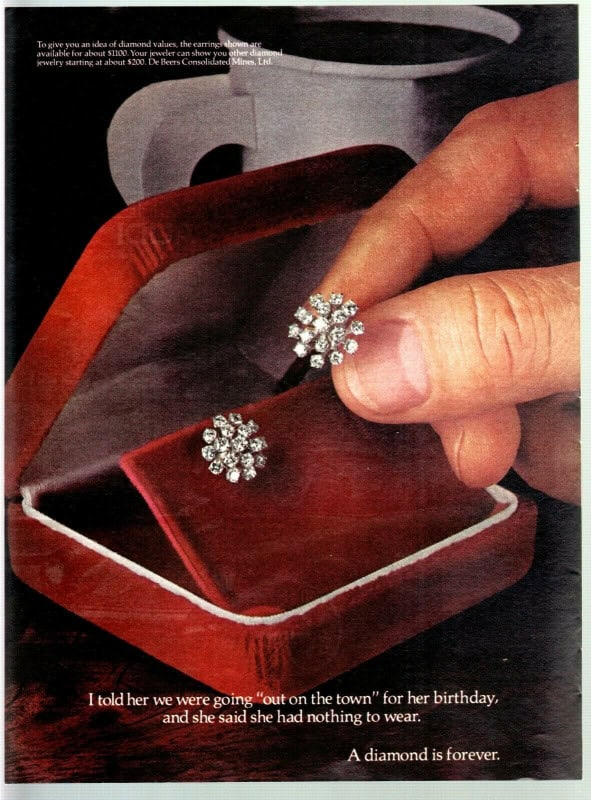
In 1947, a young N.W. Ayer copywriter named Frances Gerety scribbled four words before bed: “A Diamond Is Forever.” The line has appeared in De Beers advertising ever since, and Ad Age named it the slogan of the 20th century.
The campaign’s genius wasn’t selling diamonds — it was manufacturing a social norm. Diamond engagement rings were far from universal before the campaign; the ads (paired with De Beers’ famous “two months’ salary” guideline in later decades) made the diamond ring feel like an ancient, non-negotiable tradition rather than a 20th-century marketing invention. And “forever” did double duty: a diamond you never resell is a diamond that never floods the market.
The persuasion lesson: the ultimate flex isn’t convincing people to buy your product — it’s convincing them it was always mandatory.
8. Listerine — “Always a Bridesmaid, Never a Bride”
- Brand: Listerine
- Agency: Lambert & Feasley
- Year: 1925
- Technique: Fear appeal (problem invention)
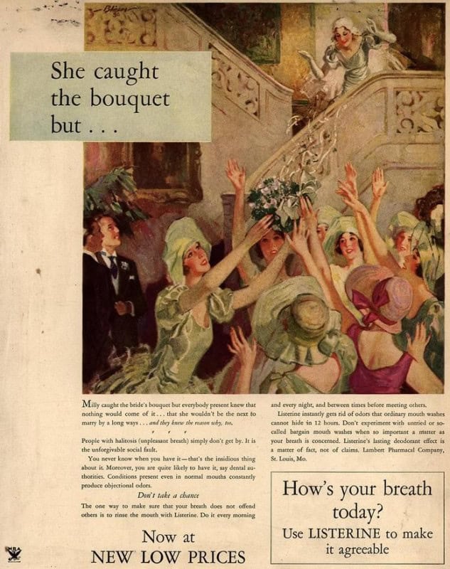
Poor Edna. The 1925 ad shows a lovely young woman and explains that she’s “often a bridesmaid but never a bride” — approaching her “tragic” thirties unmarried, all because of halitosis no friend would dare mention to her. The campaign spawned a whole cast of jilted heroines — the ad above follows Milly, who “caught the bouquet, but…”
Listerine was originally sold as a surgical antiseptic and even a floor cleaner. The company didn’t invent mouthwash; it invented the problem — taking the obscure medical term “halitosis” and turning it into a silent social catastrophe that only Listerine could avert. By one famous account, company revenue rose from about $115,000 in 1921 to more than $8 million by 1928. It’s one of the most effective (and most ethically debated) fear appeals ever printed.
The persuasion lesson: fear sells hardest when the threat is invisible, social, and unmentionable — but modern advertisers should note how the tactic aged.
9. Cadillac — “The Penalty of Leadership”
- Brand: Cadillac
- Copywriter: Theodore F. MacManus
- Year: 1915
- Technique: Flattery + reframing criticism as proof of greatness
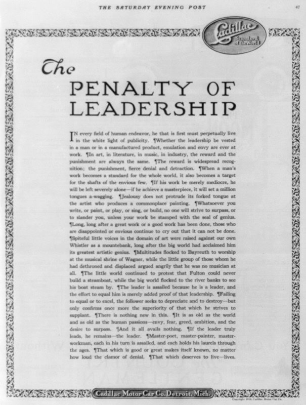
Cadillac’s new V8 engine had suffered embarrassing early problems, and rival Packard was circling. Theodore MacManus responded with an ad that never mentions the V8, never mentions Packard — and never even shows a car. Just a full page of serene text in the Saturday Evening Post arguing that every true leader, from artists to industrialists, is attacked by envious also-rans: “The leader is assailed because he is a leader.”
It ran exactly once, yet became one of the most reprinted and requested ads of the century. Buyers weren’t given a single fact about the car — they were handed an identity: people of taste recognize greatness, and greatness attracts critics.
The persuasion lesson: when under attack, don’t answer the criticism — reframe the existence of criticism as evidence of your superiority.
10. Clairol — “Does She… or Doesn’t She?”
- Brand: Clairol
- Agency: Foote, Cone & Belding (Shirley Polykoff)
- Year: 1956
- Technique: Curiosity + plausible deniability
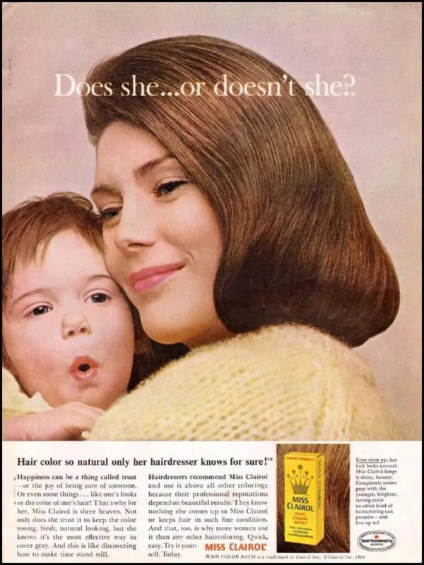
In the mid-1950s, dyed hair carried a stigma — it was for actresses, not respectable women. Copywriter Shirley Polykoff’s teasing headline made the taboo deniable: “Does she… or doesn’t she? Hair color so natural only her hairdresser knows for sure.”
The double entendre got the attention; the wholesome photos of mothers with children made coloring your hair feel safe and mainstream. Over the following two decades, the share of American women coloring their hair rose from roughly one in fifteen to nearly half, and Clairol dominated the category it had normalized.
The persuasion lesson: to sell a taboo product, don’t fight the stigma head-on — engineer deniability so trying it feels risk-free.
11. The Economist — “‘I never read The Economist.’ — Management trainee. Aged 42.”
- Brand: The Economist
- Agency: Abbott Mead Vickers, now AMV BBDO (David Abbott)
- Year: 1988
- Technique: Status anxiety (FOMO)
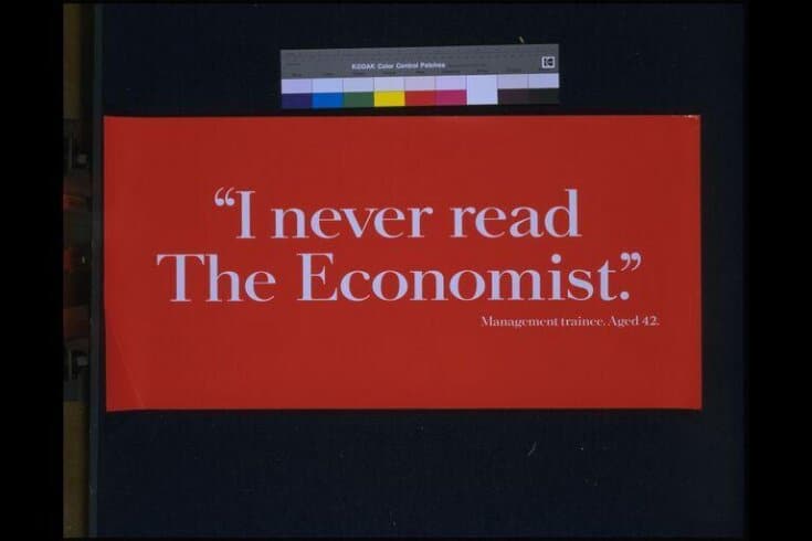
White type on Economist-red. Nine words. The most efficient status threat in advertising history: the only person quoted as not reading The Economist is a 42-year-old still stuck in a trainee job.
David Abbott’s poster — print’s billboard-sized sibling — launched a campaign of red one-liners that ran for decades (“Great minds like a think”), all built on the same inversion: never describe the magazine, only the gap between readers and non-readers. It flattered subscribers, needled everyone else, and made a news weekly into a badge you wear.
The persuasion lesson: for status goods, advertise the consequence of not buying.
12. Absolut Vodka — “Absolut Perfection”
- Brand: Absolut
- Agency: TBWA
- Year: 1980
- Technique: Pattern + consistency (the long game)
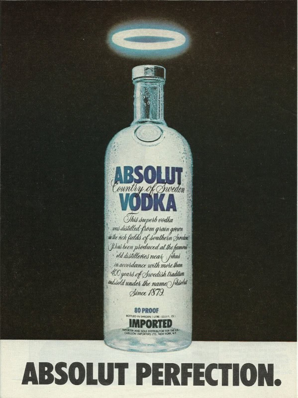
A bottle with a halo. Two words: “Absolut Perfection.” From that 1980 template, TBWA built what became one of the longest-running print campaigns ever — well over a thousand variations, always the bottle (or its silhouette in a pool, a skyline, a ski slope), always the two-word headline.
The repetition turned readers into participants: spotting the bottle became a game, and people literally collected and traded the ads. Over the campaign’s first two decades, Absolut grew from a tiny Swedish import selling around 10,000 cases a year in the US into one of America’s best-selling imported vodkas, moving millions of cases annually.
The persuasion lesson: a format repeated with wit compounds like interest — each new ad borrows trust from every ad before it.
13. MilkPEP — The Milk Mustache (“got milk?”)
- Brand: America’s Milk Processors (MilkPEP)
- Agency: Bozell Worldwide (print campaign; “got milk?” line by Goodby, Silverstein & Partners)
- Year: 1995
- Technique: Social proof via celebrity uniformity
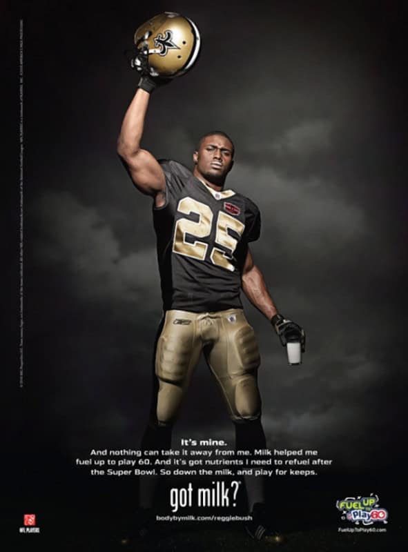
The “got milk?” line was born in a 1993 TV spot, but it was the milk-mustache print campaign that conquered the country: hundreds of celebrities — athletes, supermodels, pop stars, even cartoon characters — photographed wearing the same white milk mustache. (The early mustache ads ran under “Milk, Where’s your mustache?”; the “got milk?” line joined the print campaign later and made the pairing iconic.)
The mustache was the masterstroke. It made wildly different famous people look momentarily identical, turning each new ad into another signature on the same petition: everyone drinks milk. Running for nearly two decades, it became one of the most recognized and most parodied campaigns in American history.
The persuasion lesson: social proof scales when you give it a repeatable visual stamp.
14. Apple — “Think Different”
- Brand: Apple
- Agency: TBWA\Chiat\Day
- Year: 1997
- Technique: Aspirational identity (borrowed greatness)
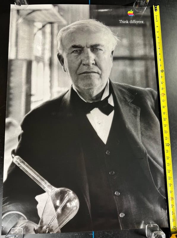
When Steve Jobs returned to a nearly bankrupt Apple in 1997, the company’s ads didn’t show a single computer. Instead: black-and-white portraits of Einstein, Gandhi, Picasso, Earhart — “the crazy ones” — with a small rainbow Apple logo and two words.
The print and billboard campaign didn’t argue that Macs were faster or cheaper (in 1997, they often weren’t). It made buying one a declaration of who you were: a creative rebel in the lineage of geniuses. The campaign marked the start of Apple’s turnaround into the most valuable brand on Earth, and it remains the cleanest example of pure identity advertising. Great portraits persuade — a trick painters mastered centuries before advertisers; see our tour of the 100 most famous paintings of all time.
The persuasion lesson: associate your brand with people your customer admires, and the customer closes the loop themselves.
15. Wonderbra — “Hello Boys”
- Brand: Wonderbra
- Agency: TBWA
- Year: 1994
- Technique: Provocation (earned media)
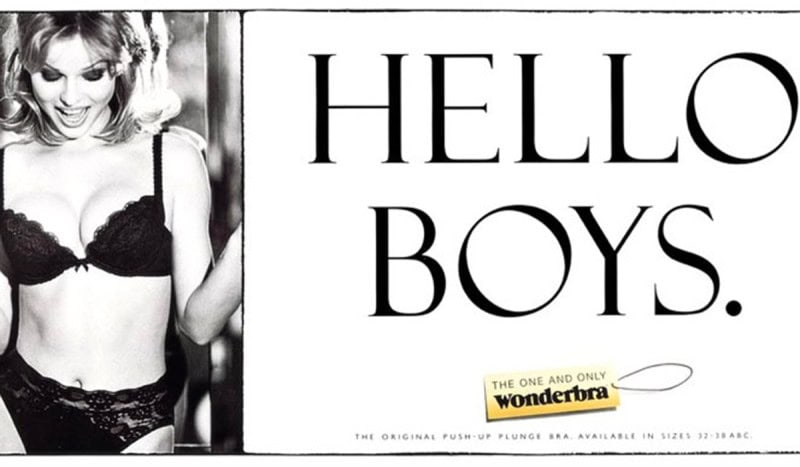
Eva Herzigova looking down at her own Wonderbra, over two words: “Hello Boys.” The 1994 campaign — billboards and press ads working as one — became a British cultural event — endlessly discussed in the press, complained about, defended, and parodied.
The genius was economic as much as creative: the controversy generated news coverage worth far more than the media budget, and “Hello Boys” entered the vernacular. Wonderbra sales surged through the mid-90s, and UK advertising bodies have repeatedly ranked it among the most iconic posters ever. It’s the print era’s blueprint for what we now call “going viral.”
The persuasion lesson: an ad provocative enough to become news stops paying for attention and starts earning it.
16. Dove — “Real Beauty”
- Brand: Dove
- Agency: Ogilvy & Mather
- Year: 2004
- Technique: Values alignment (the brand as ally)
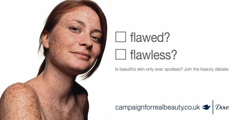
Dove’s 2004 launch ads showed women who looked nothing like supermodels next to provocative tick-boxes: “oversized? outstanding?” “wrinkled? wonderful?” — and invited the public to vote.
Like Always’ “Like a Girl” a decade later (which appears on our TV-ads list), the product almost vanishes; what’s being sold is the brand’s position in a cultural argument. The campaign generated enormous press, ran for two decades, and is widely credited with helping grow Dove into one of Unilever’s multi-billion-dollar brands. It also drew real criticism — a soap company grading women’s looks is still a soap company grading women’s looks — which is itself a lesson in how values-based persuasion invites scrutiny of the persuader.
The persuasion lesson: taking a side in a conversation your customers already care about buys loyalty no product claim can.
17. Patek Philippe — “You never actually own a Patek Philippe. You merely look after it for the next generation.”
- Brand: Patek Philippe
- Agency: Leagas Delaney
- Year: 1996
- Technique: Reframing price via legacy (loss aversion inverted)
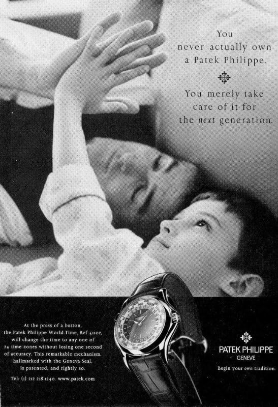
How do you sell a watch that costs as much as a car when a $10 quartz watch keeps better time? Leagas Delaney’s answer, running nearly unchanged since 1996: you don’t sell a watch at all. “You never actually own a Patek Philippe. You merely look after it for the next generation.”
In one sentence, an indefensible price becomes an heirloom, a duty, a gift to your children — and not buying becomes the selfish act. The accompanying father-and-son photography has barely changed in almost three decades, because the argument doesn’t age.
The persuasion lesson: when the price can’t be justified, change what’s being purchased.
18. KFC — “FCK”
- Brand: KFC
- Agency: Mother London
- Year: 2018
- Technique: Disarming apology (humor + accountability)
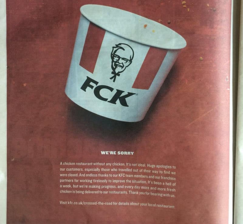
In February 2018, KFC ran out of chicken across most of its UK restaurants — a logistics failure so absurd it led national news. The response, a full-page ad in The Sun and Metro: an empty bucket with the letters rearranged to “FCK,” followed by a plainly written apology.
It’s the modern “Lemon”: self-deprecation so honest it converts a disaster into affection. The ad won top honors at Cannes and the crisis became a brand-building moment — surveys afterward showed public sentiment toward KFC recovering almost immediately.
The persuasion lesson: in a crisis, the fastest route back to trust is an apology that sounds like a human wrote it.
Most Persuasive Print Ads of All Time — In Conclusion
Strip away the decades and the products, and the same handful of levers appears again and again: honesty that disarms (VW, KFC), identity that flatters (Marlboro, Apple, Cadillac), fear and status that needle (Listerine, The Economist), and norms invented so smoothly we forgot they were invented at all (De Beers).
The next time an ad stops your scroll, pause and name the technique — chances are it’s one of the eighteen above wearing modern clothes. And if you want to see how these same levers translate to motion and sound, our list of the most persuasive TV ads of all time picks up where print left off.